Brand Foundation
What Comfyballs is, who it's for, and the reasoning behind naming a Norwegian underwear brand after its most memorable anatomical feature.
"We make the part of your wardrobe nobody talks about designing for — and we are very serious about it."
Founded in Asker, Norway in 2013 because the founder wanted the ultimate boxer and couldn't find one. So he made it. The PackageFront™ panel eliminates the adjustment. Three million pairs later, it works.
What we stand for
The line
We are not
- ×A dark, aggressive performance brand (that's SAXX)
- ×A comfort-lifestyle brand with warm domestic photography (that's Tommy John)
- ×Loud, juvenile, or trying too hard — we don't make innuendo jokes
- ×A brand that uses exclamation points, superlatives, or urgency fabrication
The Conscious Hedonist
Demographics
Men 25–45, Nordic & Northern European, digitally native, middle-to-upper-middle income. Urban or suburban. Active but not exclusively athletic.
Psychographics
Values quality over brand status. Researches before buying. Has a sense of humor about himself. Trusts function over marketing. Buys in multi-packs once convinced.
Decision drivers
Comfort and fit first. Material honesty. Volume of real reviews. Clear returns policy. Personality alignment — honest, unpretentious, not trying to be cool.
Approved taglines
Taglines are locked. Do not write new ones without brand voice authority sign-off. Do not add exclamation points.
Logo Usage
The wordmark is a lowercase geometric-rounded SVG in burgundy #5C181A. It carries the brand's dual archetype in a single glyph: precise enough to read as engineered, human enough to feel approachable.
Logo on approved backgrounds
On white — primary use
Clear space & minimum size
Clear space rule
Minimum clear space on all sides equals the cap-height of the wordmark — approximately 18% of the logo's total height. Nothing encroaches: no text, no images, no borders.
Minimum size
Screen: 120px wide minimum. Print: 32mm wide minimum. Below these sizes, the ® symbol and fine stroke detail become illegible — use the favicon mark instead.
Logo misuse — do not do these
Do not stretch or distort
Do not recolor outside palette
Do not place on busy backgrounds
Additional misuse: do not rotate, add drop shadows, outline the letterforms, or apply transparency effects to the wordmark.
Color Palette
Burgundy #6B262C is the single most defensible chromatic asset in the category. Every competitor uses navy, purple, forest green, or black-and-white. The warm wine-earth territory is uncontested.
Brand colors
Three-tier accessibility system
Burgundy #6B262C has ~8.4:1 contrast on white but only ~2.3:1 on dark charcoal. A single color value cannot solve both surfaces. Three purpose-built tiers give each context a compliant value. EU/EEA WCAG AA is a legal requirement.
Expression
#6B262C
Decorative backgrounds, borders, fills. No text usage obligation.
Text-safe
#5A1F25 — 12.67:1
All body copy and links on light surfaces. The only approved value for paragraph-length text.
Light tint
#E8B4B8 — 8.5:1 on dark
Text and icons on dark surfaces. Subtle background tint for warm callout areas.
Color in context
As section background
As dark editorial surface
3,247 verified reviews
"The adjustment is gone. That's the whole review."
As light page background
Tinted neutrals vs. generic gray
Generic gray (avoid)
#f5f5f5 — cold, clinical#e5e5e5 — generic DTC#737373 — untinted mid-grayBrand-tinted neutrals (use these)
#F7F2F0 — warm toward burgundy#EBE4E1 — neutral-100#7A6962 — neutral-500Neutral scale
50
100
200
300
400
500
600
700
800
900
CSS color tokens — for developers
/* Three-tier burgundy system */
--color-burgundy: #6B262C;           /* expression */
--color-burgundy-safe: #5A1F25;      /* text on light, 12.67:1 */
--color-burgundy-tint: #E8B4B8;      /* text/icons on dark, 8.5:1 */

/* Brand palette */
--color-near-black: #0F0B0A;
--color-off-white: #F7F2F0;
--color-butter-cream: #FFF6CB;

/* Tinted neutrals (burgundy-ward, OKLCH hue ~15°) */
--color-neutral-50:  #F7F2F0;
--color-neutral-100: #EBE4E1;
--color-neutral-200: #D9CFCB;
--color-neutral-300: #C0B2AC;
--color-neutral-400: #A3938C;
--color-neutral-500: #7A6962;
--color-neutral-600: #6D5B55;
--color-neutral-700: #54423D;
--color-neutral-800: #3B2C28;
--color-neutral-900: #241816;
Typography
Fraunces is the single most differentiating brand asset in the category. No men's underwear competitor uses a serif of any kind. The 2025–2026 editorial typography revival makes this choice culturally current at precisely the right moment.
Heading typeface
Fraunces
Light italic — editorial callouts
A B C D E F G H I J K L M N O P Q R S T U V W X Y Z
a b c d e f g h i j k l m n o p q r s t u v w x y z
0 1 2 3 4 5 6 7 8 9 — . , : ; ! ? ' "
Optical-size-aware variable font. Loads from Google Fonts. Weights: 300 (italic editorial), 700 (all headings), 900 (display/hero). The variable axis enables fine-tuned optical sizing at every display breakpoint.
Body typeface
Outfit
300 / 400 / 500 / 600
A B C D E F G H I J K L M N O P Q R S T U V W X Y Z
a b c d e f g h i j k l m n o p q r s t u v w x y z
0 1 2 3 4 5 6 7 8 9 — . , : ; ? ' "
Geometric sans with a slightly wider-than-neutral character width. Contemporary Nordic in register — spacious, confident. Acts as the straight man to Fraunces' personality. Weights: 300 (supporting copy), 400 (body), 500 (UI/nav/labels), 600 (h4/prices/emphasis).
Type scale — live rendering
"Fraunces 300 italic is reserved for pull quotes and editorial callouts. The weight contrast against Bold headings reinforces hierarchy beyond size alone — this is a typographic personality move, not a decoration."
Rules
Heading font hierarchy
Fraunces for Display through H3 (editorial). Outfit for H4 and below (functional). The font-family break at H4 creates a clear visual signal: above is authored, below is informational.
Letter-spacing
Headings: -0.025em to -0.035em (tighter at display scale). Body: +0.01em. UI labels: +0.02em. Small/caps: +0.03em to +0.08em. Never default 0 across the board.
Line length
Body copy: 60–75 characters maximum. Lead paragraphs: 55–65ch. Never let full-container-width prose — cap at 65ch with max-width. Prevents eye fatigue on long product descriptions.
Button & nav text
Always Outfit 500 at 15px, 0.02em tracking. Never Fraunces in interactive elements — that font is editorial, not functional. Sentence case, never all-caps on buttons.
CSS typography tokens — for developers
/* Font families */
--font-heading: 'Fraunces', Georgia, serif;
--font-body: 'Outfit', system-ui, sans-serif;

/* Type scale (Major Third 1.250) */
--text-display: 98px;    /* Fraunces 900 — hero only */
--text-h1: 78px;         /* Fraunces 700 */
--text-h2: 49px;         /* Fraunces 700 */
--text-h3: 31px;         /* Fraunces 700 (italic 300 for quotes) */
--text-h4: 25px;         /* Outfit 600 */
--text-lead: 20px;       /* Outfit 400 */
--text-base: 16px;       /* Outfit 400 */
--text-ui: 15px;         /* Outfit 500 */
--text-sm: 13px;         /* Outfit 400 */
--text-caption: 11px;    /* Outfit 400 */

/* Letter-spacing */
--tracking-display: -0.035em;
--tracking-heading: -0.025em;
--tracking-body: 0.01em;
--tracking-ui: 0.02em;
--tracking-label: 0.08em;    /* caps/labels */

/* Mobile scale (below 768px) */
/* display: 52px · h1: 40px · h2: 28px · h3: 22px · h4: 18px */
Brand Voice & Tone
Direct, dry, technically honest with a wink. The humor is in what's not said as much as what is. We are very serious about underwear. This is not a contradiction.
Voice attributes
Voice in action — right vs. wrong
Correct voice
"The PackageFront™ panel moves with you, not against you. It eliminates the adjustment. We've had 3,000,000 pairs of proof."
"Your drawer is boring. We can fix that."
Wrong voice
"Experience the ULTIMATE in men's comfort! Our revolutionary ball-park technology will CHANGE YOUR LIFE!"
"Don't miss our INCREDIBLE sale!! Limited time only! 😂👇"
Tone by channel
Words and patterns to avoid
Humor is always human-authored. Prohibited-phrases list updated quarterly. Any copy including "legendary," "game-changing," "revolutionary," or "ultimate" flagged for immediate rewrite.
Photography & Imagery
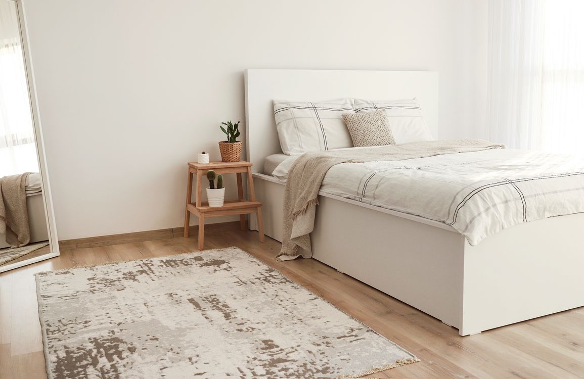
Nordic natural light — low-angle, warm-diffused, atmospheric. The competitive landscape is nightclub drama (SAXX), Pacific Northwest outdoors (BN3TH), and domestic soft-focus (Tommy John). None occupies genuinely designed-in-Norway.


Photograph
- ✓Confident, unhurried men in natural environments
- ✓Morning routines, relaxed domestic moments, low-key athletic contexts
- ✓Warm diffused natural light — the quality of Nordic golden hour
- ✓Fabric close-ups: textile weaves, construction details, material honesty
- ✓Scandinavian interiors: dark neutrals, natural wood, considered space
Avoid
- ×Overtly sexualized poses or implied-nudity staging
- ×Neon or colored artificial lighting (the SAXX register)
- ×Over-retouched, hyper-smooth AI-aesthetic skin
- ×Generic stock setups — office environments, studio white limbo
- ×Exclusively gym or extreme-fitness contexts (misrepresents everyday comfort)
File specifications & aspect ratios — for art directors and developers
Hero images
16:9 desktop · 4:3 tablet · 1:1 mobile
Min: 2560×1440px
Format: WebP + JPEG fallback
Max size: 400KB compressed
Product cards
4:5 aspect ratio (portrait) locked across all breakpoints
Min: 900×1125px
Background: neutral-50 (#F7F2F0) for transparency
Minimum 3 angles per product
Detail / texture
1:1 square for grid cards
Macro detail: min 1500×1500px
Supports zoom at 2×
Color grade: warm, high contrast, never cool-blue
Website & E-Commerce
Creator + Jester archetype applied to conversion. Editorial asymmetry drives brand impression. Swiss-disciplined commerce grids drive purchase. The system knows when to perform and when to step aside.
Button system
Outfit 500 at 15px, 0.02em tracking, sentence case. Minimum 48px height (WCAG 2.5.5). Hover: scale(1.01) + brand shadow at 150ms ease-out. Never Fraunces in interactive elements.
Product card
4:5 aspect ratio image. Grain overlay at 4–5% on card surface. 3-column desktop grid (300px min), 2-column tablet, 1-column mobile. Hover reveals quick-size-select on desktop.
Form inputs — all states
Input font-size minimum 16px (prevents iOS auto-zoom). Inline validation — real-time error feedback per field, not on submit. All inputs have explicit label elements.
Enter a valid Norwegian postal code (4 digits)
Navigation component
Shadow system
Shadow 1
Inputs, chips
Shadow 2
Cards, default
Shadow 3
Dropdowns, hover
Burgundy
CTA hover, focus
Trust badge row
Placed within 200px of the primary CTA. Evidence-forward, never superlative. Review counts as actual numbers. Guarantee copy is specific. CRO data: reviews near CTA +34% click-through (Baymard 2024).
60-day guarantee
Full refund if not comfortable
Free delivery
Orders over 499 kr
4.8 — 3,247 reviews
Verified purchases only
Secure checkout
Visa · Mastercard · Vipps
Sticky mobile CTA bar
Highest-ROI single mobile UX improvement. 56px height. Full-width on mobile. iOS safe-area-inset-bottom padding. Touch targets 48×48px minimum.
Brand moments — interactive states
Creator archetype: motion reveals as if being made. Jester secondary: playful surprise, deadpan. The humor lands because it doesn't announce itself.
Hover state
scale(1.01) + shadow-burgundy
150ms ease-out
Skeleton loading
neutral-100/200 shimmer · 1.5s linear · no spinners
Conversion architecture — above-fold product page
7/5 asymmetric split. All 5 above-fold requirements visible without scrolling: product name, primary image, price, CTA, star rating + review count. CTA above fold: +304% vs. below-fold (Baymard 2024).
Signature element — grain texture in real contexts
Component tokens & code — for developers
/* Buttons */
--btn-height: 48px;               /* WCAG 2.5.5 minimum */
--btn-padding: 14px 24px;
--btn-radius: var(--radius-sm);   /* 4px */
--btn-font: var(--font-body);
--btn-weight: 500;
--btn-size: 15px;
--btn-tracking: 0.02em;
--btn-transition: all 150ms cubic-bezier(0.0, 0.0, 0.2, 1);

/* Primary CTA */
background: var(--color-burgundy);    /* #6B262C */
color: var(--color-neutral-50);       /* #F7F2F0 */
/* Hover: */
transform: translateY(-1px) scale(1.01);
box-shadow: 0 4px 16px rgba(107,38,44,0.25);

/* Cards */
--card-radius: var(--radius-md);      /* 6px */
--card-padding: 16px–24px;
--card-shadow: var(--shadow-md);
/* Hover: */
box-shadow: 0 8px 32px rgba(15,11,10,0.14), 0 4px 8px rgba(15,11,10,0.08);
transform: translateY(-2px);

/* Inputs */
height: 48px;
border: 1px solid var(--color-neutral-300);
border-radius: var(--radius-sm);    /* 4px */
font-size: 16px;                    /* prevents iOS zoom */
/* Focus: */
border-color: var(--color-burgundy);
box-shadow: 0 0 0 3px rgba(107,38,44,0.12);
/* Error: */
border-color: #C0392B;
background: #FEF0EE;

/* Border radius scale */
--radius-sm: 4px;   /* buttons, inputs, UI components */
--radius-md: 6px;   /* product frames, image containers */
--radius-lg: 10px;  /* cards, drawers, feature blocks */
--radius-pill: 9999px; /* quantity chips, size toggles */
Live Page Preview
All system elements in context — a representative product page built entirely with this design system.
Social Media
Platform standards, content pillars, and community voice — so every post is recognisably Comfyballs, whether you're in the caption or in the comments.
Profile Standards
Profile Photo
Favicon: white "C" on burgundy circle, no safe zone padding. The wordmark is too small at profile scale — the monogram works harder. Consistent across Instagram, Facebook, LinkedIn, TikTok.
Bio Language
Direct and specific. "Engineering precision. For the part of your life nobody designs for. PackageFront™ technology — 3M+ pairs." No emojis in the bio. Link to current campaign or size guide, not homepage.
Cover / Header
LinkedIn header: Near Black with burgundy crop-band and a single editorial product image, no tagline overlay. Facebook cover: campaign-current, 820 × 312px, product photography or campaign still. Updated quarterly minimum.
Content Pillars
Four pillars. Each one earns its place in the feed because it's specific — not because it's "content." One post can serve multiple pillars; most should serve one well rather than all of them weakly.
Product Engineering
The craft behind the product. Close-ups of flatlock seams, PackageFront™ panel construction, material details. Tone: technical but never dry. One specific claim, not a feature list.
Instagram carousel Reels (15–30s)Honest Wit
The Jester layer. Copy-led posts, deadpan observations about the problem Comfyballs solves, or the absurdity of men tolerating bad underwear for 30 years. Always human-authored — never AI-generated.
Instagram single TikTokSocial Proof
Customer reviews and UGC, curated not plastered. Specific quotes that reference product function, not vague enthusiasm. Volume indicators ('3,247 reviews. Most mention the seams.') over generic star icons.
Instagram Stories UGC repostsScandinavian Craft
The 'designed in Norway' origin story. Behind-the-design content, material sourcing, the founder story. No performative sustainability claims — factual craft heritage only.
LinkedIn Instagram editorialPlatform-Specific Rules
- Feed: 4:5 portrait or 1:1 square. Never 16:9 landscape.
- Captions under 100 characters when possible. One idea. No hashtag walls.
- Stories: branded frame with burgundy top band. Poll/question stickers in Outfit font.
- Reels: product in motion within first 2 seconds. No intro cards.
TikTok
- 9:16 only. Native, not repurposed Instagram content.
- On-screen text in Outfit 500 white, 80% opacity, bottom-third placement.
- Hook in first 1.5 seconds — product in use, not a brand intro slide.
- Comment replies: brand voice at one register looser than editorial. Still no exclamation points.
- Craft and engineering content only. No product promotions.
- Founder voice permitted. Technical authority register.
- Company milestones (sales volume, new markets) — specific numbers, no 'thrilled to announce.'
- Images: editorial photography, never promotional campaign creative.
Branded Hashtags
Use sparingly. Three maximum per post. No hashtag walls — they signal low-effort content.
Community Management Tone
Respond this way
- Acknowledge the specific question. Answer it.
- DM for order issues immediately — don't troubleshoot in comments.
- Repost UGC with explicit permission and credit. Minimum 3 genuinely positive mentions before reposting.
- Size questions: link directly to the specific product's size guide drawer.
Escalation triggers
- Any complaint about product defect — escalate to CS within 2 hours.
- Competitor mentions in comments — do not engage. No brand-vs-brand copy in public channels.
- Inappropriate content tagged on brand posts — remove, document, block if repeated.
- Influencer collaboration requests — route to partnerships, do not respond publicly.
Email Marketing
Template zones, tone calibration by email type, and subject line rules — the inbox is where Comfyballs' direct, dry register converts most efficiently.
Master Template Zones
Tone by Email Type
| Email Type | Tone | Example Subject Line |
|---|---|---|
| Welcome | Warm, honest, storytelling — the origin story earns trust before asking for a purchase | Anders couldn't find the right underwear. So he made it. |
| Promotional | Direct, benefit-led — the offer stated plainly, one personality line | 3 pairs. Same price as 1 from a department store. |
| Replenishment | Factual, light human touch — functional without being cold | Your last order was 6 months ago. The seams are still fine, but. |
| Transactional | Brand steps aside completely. Clean, functional, zero personality | Order #CB-28371 confirmed |
| Campaign/Gift | Personality moves to opener — the creative does the work, the specs follow | Father's Day. He adjusts in public. This solves that. |
Subject Line Rules
Do
- Max 55 characters — mobile preview is unforgiving
- Specific numbers and claims: "62% of our customers re-order"
- Dry wit: deadpan observation, unexpected word choice
- Lowercase subject lines when the voice allows
Never
- Urgency fabrication: "Only 3 hours left"
- ALL CAPS in any part of the subject line
- Exclamation points (zero exceptions in subject lines)
- "RE:" or "FWD:" fake familiarity tactics
Digital Advertising
Ad asset specs, copy formula, and the non-negotiable rule that the ad and the landing page must look like the same brand made them.
Ad Format Size Guide
Leaderboard
GDN · Desktop
Med. Rectangle
GDN · All
×
600
Half Page
GDN · Premium
1080
Meta Square
Instagram Feed
1350
Meta 4:5
Meta Feed
1920
Stories / Reels
Meta · TikTok
Copy Formula
Approved CTA Language
Prohibited CTA language: "Shop now" (vague), "Buy today" (urgency-adjacent), "Limited time offer" (fabricated urgency), "Don't miss out" (pressure-based). The CTA should name what the person is about to do — not pressure them into doing it.
Logo Placement in Ads
Logo in bottom-left corner on all static ad formats. Minimum 24px wordmark height in digital formats. On dark backgrounds: use light/white variant. On light or medium backgrounds: use dark/burgundy variant. Never center the logo in an ad — it reads as amateur. Minimum clear space: equal to the cap-height of the wordmark on all sides.
Motion & Video
Deadpan choreography. Motion lands like the copy — because it arrives without announcement. These demos are live. Watch them.
Easing Showcase
Four approved easing curves. All demos loop infinitely — not a slideshow.
Micro-interaction Demos
CTA Button Hover
translateY(-3px) + burgundy shadow bloom · 200ms brand spring
Skeleton Loader
1500ms linear shimmer · no spinners permitted
Duration Reference
Same fill animation at three speeds. The difference is immediate.
Signature Element: Grain Texture in Motion
The grain flickers at 4–6fps — a continuous ambient presence, not a transition. It is felt before it is seen. This demo shows the flicker live on both dark and burgundy surfaces.
mix-blend-mode: overlay · opacity 0.030–0.048 · ~6fps
mix-blend-mode: overlay · opacity 0.040–0.055 · ~6fps
Video Pacing & Aspect Ratios
Pacing Principles
- Confident, movement-focused. Never frenetic.
- Cut rhythm: 2–4 seconds per editorial shot, 1–2 seconds for product detail.
- No jump cuts on the product — the viewer needs time to see the engineering.
- Music: understated, instrumental, no lyrics. Never high-energy EDM.
- Caption: Outfit 500, white, bottom-third, 80% opacity background strip.
Aspect Ratio Safe Zones
16:9
YouTube / Desktop
1:1
Instagram Feed
9:16
Stories / Reels
Dashed inset = safe zone. Keep copy and faces inside. 9:16 reserves bottom 15% for CTA overlay.
Motion Token Reference (CSS) click to expand
/* Tier 1 — Structural (invisible infrastructure) */
--duration-t1-fast:   150ms;
--duration-t1-base:   200ms;
--duration-t1-slow:   300ms;
--ease-t1:            cubic-bezier(0.22, 0.03, 0.26, 1.0);

/* Tier 2 — Brand (authored personality) */
--duration-t2-fast:   400ms;
--duration-t2-base:   600ms;
--duration-t2-slow:   800ms;
--ease-t2-spring:     cubic-bezier(0.34, 1.20, 0.64, 1.0);
--ease-t2-spring-max: cubic-bezier(0.34, 1.56, 0.64, 1.0);

/* Grain animation (signature element) */
/* animation: cb-grain-flicker 167ms steps(1, end) infinite; */
/* ~6fps ambient flicker — always prefers-reduced-motion guarded */

/* Checkout / transaction zones — zero expression */
--duration-checkout: 0ms; /* no animation in purchase flow */Accessibility & Compliance
WCAG 2.1 AA is the legal floor for EU/EEA brands — not a best-effort aspiration. Every component ships accessible or doesn't ship.
WCAG 2.1 AA Compliance Statement
Comfyballs operates under EU/EEA jurisdiction. WCAG 2.1 AA is both the legal floor (EAA — European Accessibility Act, effective 2025) and the operational standard for all digital touchpoints. Minimum contrast: 4.5:1 for normal text, 3:1 for large text (≥18px or ≥14px bold) and UI components. Target WCAG AAA (7:1) for body copy where the palette permits.
Contrast Ratio Table
| Text | Background | Ratio | AA Normal | AA Large |
|---|---|---|---|---|
|
Near Black #0F0B0A
|
Off-White #F7F2F0
|
17.8:1 | PASS | PASS |
|
Burgundy Text-Safe #5A1F25
|
Off-White #F7F2F0
|
8.2:1 | PASS | PASS |
|
Burgundy Expression #6B262C
|
Off-White #F7F2F0
|
6.4:1 | PASS | PASS |
|
Off-White #F7F2F0
|
Near Black #0F0B0A
|
17.8:1 | PASS | PASS |
|
Burgundy Tint #E8B4B8
|
Near Black #0F0B0A
|
8.5:1 | PASS | PASS |
|
Burgundy Expression #6B262C
|
Near Black #0F0B0A
|
2.4:1 | FAIL | FAIL |
|
Note: Burgundy #6B262C on Near Black is decorative-only (backgrounds, borders, fills). Never use as text on dark surfaces — use Tint #E8B4B8 for dark-surface text/icons. |
||||
Focus-Visible Demo
Tab through the elements below to see the brand focus ring. It uses outline: 2px solid #6B262C; outline-offset: 2px on all interactive elements.
Compliance Checklist
Interaction
- All interactive elements have :focus-visible ring
- Skip-to-content link as first body child
- Touch targets ≥44×44px on all mobile elements
- prefers-reduced-motion wraps all animations
Content & Legal (EU/EEA)
- All images have descriptive alt text
- Cookie consent banner styled with brand tokens, clearly separate from site content
- Privacy Policy linked in every email footer
- GDPR-compliant unsubscribe in all marketing email footers
Partner & Retailer Usage
Asset kit contents, co-branding rules, and marketplace listing templates. Partners are custodians of the brand — these rules exist to keep that custody coherent.
Partner Asset Kit Contents
Included in Partner Kit
- Logo SVG — dark variant (on light), light variant (on dark)
- Logo PNG — 2x resolution, transparent background, both variants
- Colour specifications: HEX, RGB, CMYK, Pantone equivalent
- Approved product photography — 12 hero images, 1200px minimum
- Approved product descriptions — per SKU, EN and NO
- This brand guide (PDF export) for reference
On Request Only
- High-resolution print files (CMYK, 300dpi)
- Co-branded asset approval (see co-branding rules below)
- Custom campaign creative for retailer-specific promotions
- Localised copy for non-EN/NO markets
Co-Branding Rules
Primary mark
Equal or lesser scale
Minimum clear space between logos: 2× the cap-height of the Comfyballs wordmark. Neither logo may be smaller than 24px wordmark height in digital contexts.
Prohibited Alterations
No stretching or distorting the wordmark
No competitor brand colors as backgrounds
No rotation or skewing of any kind
Marketplace Listing Template
Title Format
Comfyballs [Product Line] [Style] Boxer — [Color] — [Sizes Available]
Example: Comfyballs Cotton Boxer — Burgundy — S-3XL
Required Description Elements
- PackageFront™ technology mention (mandatory for all boxer products)
- Fabric composition with percentages (e.g., 95% organic cotton, 5% elastane)
- Key construction detail (flatlock seams)
- Care instructions
- Size guide link or table
Required Images
- Hero product image on white/neutral (1:1, min 1200px)
- Worn lifestyle image (4:5, min 1080px)
- Detail shot (seam, fabric texture, waistband) (1:1)
- Size guide image
Do's & Don'ts
Print this page. Pin it up. The rules that matter most — in the order they get broken most often.
Logo
Do
Dark wordmark on light backgrounds. Proportional, unmodified. Clear space respected.
Light wordmark on dark backgrounds. Always the correct variant for the surface.
Don't
Never stretch, squash, or distort the wordmark. It is geometry, not decoration.
Never place the logo on a gradient background or competitor-adjacent color.
Color
Do
Four-color system only. Every surface derives from these four. The warmth comes from how they're combined, not from adding new colors.
Don't
No pure grays (untinted = generic), no off-brand accent colors, no brand-adjacent competitor hues like SAXX purple or BN3TH brown.
Typography
Do
Heading in Fraunces
Body copy in Outfit. Clear hierarchy. Never reversed.
Fraunces headings — editorial authority. Outfit body — utilitarian clarity. The combination is the brand's typographic fingerprint.
Don't
HEADING IN WRONG FONT
Body in serif. Arbitrary sizes. No scale.
Never use Arial/Helvetica/Times for brand content. Never use arbitrary type sizes outside the scale. Never use more than two typefaces.
Photography
Do
- Natural Nordic light — warm-diffused, directional, atmospheric
- Models as real people, not archetypes or perfection objects
- Product detail close-ups that show engineering craftsmanship
- Everyday contexts: morning, rest day, getting dressed
Don't
- Neon or studio flash-heavy photography (SAXX aesthetic — rejected)
- Generic stock photography (reads as template-assembled)
- Exclusively gym/performance settings — Comfyballs is for daily life
- Heavy Instagram-style filters that flatten the brand's warm tones
Voice & Tone
Do
"The PackageFront™ panel moves with you, not against you. It eliminates the adjustment. We've had 3,000,000 pairs of proof."
Specific. Evidence-backed. A single dry wit moment lands precisely because the rest is plain.
Don't
"Experience the ULTIMATE in men's comfort! Our revolutionary technology will CHANGE YOUR LIFE! Don't miss our INCREDIBLE sale!!"
No superlatives, no exclamation points, no urgency fabrication. This sounds like every other DTC brand — which means it sounds like none of them.
Dark Mode / Theme Variants
Dark mode is Comfyballs' native register. The system formalises what the brand already does — and makes it consistent rather than inherited.
Light / Dark Comparison
PackageFront™ Cotton
Flatlock seams. No adjustment required. Available in 8 colorways.
Sample Card
Body text on Surface-2
Surface-2: #FFFFFF
Text: #0F0B0A
Sample Card
Body text on Surface-2
Surface-2: #241816
Text: #F7F2F0
Surface Scale Comparison
Light Mode Surfaces
Dark Mode Surfaces
Brand Color Shift Table
| Color Role | Light Mode | Dark Mode | Note |
|---|---|---|---|
| Burgundy decorative fills | #6B262C |
#6B262C (unchanged) |
Backgrounds and borders only — never text on dark |
| Burgundy text / icon | #5A1F25 |
#E8B4B8 |
8.5:1 contrast on Surface-0 |
| Primary text | #0F0B0A |
#F7F2F0 |
Inverted. Both pass AAA. |
| Butter Cream accent | #FFF6CB |
#FFF6CB (unchanged) |
~14:1 on Surface-0. No change needed. |
Dark Mode CSS Override Block click to expand
/* Adaptive dark mode — surfaces and text invert, brand colors preserved */
@media (prefers-color-scheme: dark) {
  [data-theme='light'] { /* skip if user forced light */ }
  :root:not([data-theme='light']) {
    --surface-0: #0F0B0A;
    --surface-1: #1A1310;
    --surface-2: #241816;
    --surface-3: #3B2C28;
    --color-text:           #F7F2F0;
    --color-text-secondary: #C0B2AC;
    --color-text-tertiary:  #A3938C;
    /* Burgundy text tier — only change for dark surfaces */
    --color-burgundy-text-safe: #E8B4B8; /* was #5A1F25 */
    /* Neutrals tinted warm */
    --color-neutral-100: #1A1310;
    --color-neutral-200: #241816;
    --color-neutral-300: #3B2C28;
    --color-neutral-400: #54423D;
    --color-neutral-500: #A3938C;
    --color-neutral-600: #C0B2AC;
    --color-neutral-700: #D4C9C4;
    --color-neutral-800: #E8DFDB;
    --color-neutral-900: #F7F2F0;
  }
}
/* Manual toggle via JS — stores in localStorage */
.dark-mode,
[data-theme='dark'] {
  --surface-0: #0F0B0A;
  --surface-1: #1A1310;
  --surface-2: #241816;
  --surface-3: #3B2C28;
  --color-text:           #F7F2F0;
  --color-burgundy-text-safe: #E8B4B8;
}Iconography & Illustration
Outlined, 1.5px stroke, round caps and joins. No competitor in the category owns a recognisable icon language — these 12 icons are a brand asset, not a utility set.
Style Rules
- Style: outlined only (no filled)
- Stroke: 1.5px at 24px (scales proportionally)
- Line caps: round
- Joins: round
- Corner radius: 2px on geometric elements
Sizing Scale
- 16px — inline text context
- 20px — buttons, nav items
- 24px — standard UI, standard stroke 1.5px
- 32px — feature callouts, stroke 2px
- 48px — hero / marketing, stroke 2px
Color States
Brand Icon Set — Priority 8
Breathability
Flatlock Seam
Temp. Regulation
4-Way Stretch
Quick Dry
Free Shipping
Comfort Guarantee
Designed in Norway
Icon at Multiple Sizes
16px
inline/text
20px
button/nav
24px
standard
32px
feature
48px
hero/marketing
Icon SVG Implementation Pattern click to expand
<!-- Standard icon pattern — inherits color via currentColor -->
<svg
  width="24"
  height="24"
  viewBox="0 0 24 24"
  fill="none"
  stroke="currentColor"
  stroke-width="1.5"
  stroke-linecap="round"
  stroke-linejoin="round"
  aria-hidden="true" <!-- when decorative -->
  role="img"         <!-- when semantic -->
  aria-label="[Descriptive label when semantic]"
>
  <!-- paths -->
</svg>

/* Icon color CSS rules */
.icon-primary  { color: var(--color-burgundy-text-safe); } /* #5A1F25 light / #E8B4B8 dark */
.icon-neutral  { color: var(--color-neutral-600); }
.icon-reversed { color: var(--color-off-white); }
.icon-disabled { color: var(--color-neutral-400); opacity: 0.4; }

/* Hover fill — 10% opacity fill of current color */
.icon-interactive:hover path,
.icon-interactive:hover circle {
  fill: currentColor;
  fill-opacity: 0.10;
  transition: fill-opacity 150ms cubic-bezier(0.22, 0.03, 0.26, 1.0);
}Data Visualization
Product comparison tables. Size guides. Feature matrices. Data in DTC underwear is informational, not analytical — the design reflects that. Burgundy-anchored, table-forward, no 3D effects.
Chart Color Sequences
Sequential — magnitude / density
#6B262C → #8B3C43 → #A8585E → #C47D82 → #DFA4A8 → #F0CDCF → #F7E8E9
Categorical — comparing distinct series
Diverging — above / below neutral
Negative: #3B2C28 · Neutral midpoint: #C0B2AC · Positive: #6B262C
Sample Chart — Product Line Comparison
Comfort Rating by Product Line
Based on 3,247 verified customer reviews. Comfort rating = % of reviewers rating 4 or 5 stars specifically on fit comfort.
Product Comparison Table Style
| Feature | Cotton | Comfycel | Performance |
|---|---|---|---|
| PackageFront™ | |||
| Quick-dry technology | — | ||
| Flatlock seams | |||
| Best for | Everyday wear | Active lifestyle | Sport / high activity |
Dataviz CSS Tokens click to expand
/* Sequential palette — burgundy to cream */
--dataviz-seq-1: #6B262C;
--dataviz-seq-2: #8B3C43;
--dataviz-seq-3: #A8585E;
--dataviz-seq-4: #C47D82;
--dataviz-seq-5: #DFA4A8;
--dataviz-seq-6: #F0CDCF;
--dataviz-seq-7: #F7E8E9;

/* Categorical palette */
--dataviz-cat-1: #6B262C;
--dataviz-cat-2: #FFF6CB;
--dataviz-cat-3: #54423D;
--dataviz-cat-4: #C0B2AC;
--dataviz-cat-5: #3B2C28;
--dataviz-cat-6: #E8B4B8;

/* Typography */
--dataviz-title-font: var(--font-heading);
--dataviz-title-size: var(--text-base);
--dataviz-title-weight: 600;
--dataviz-axis-font: var(--font-body);
--dataviz-axis-size: var(--text-xs);
--dataviz-axis-color: var(--color-neutral-500);
--dataviz-grid-color: #3B2C28;
--dataviz-grid-opacity: 0.5;AI Content Governance
AI can draft. It cannot author. The distinction matters more for a brand whose voice is its primary competitive differentiator.
Approved vs. Prohibited Content
AI-Approved
- Product description first drafts (Cotton, Comfycel)
- Email replenishment and bundle campaign copy
- Size guide and technical specification copy
- Meta descriptions and SEO supporting copy
- Social caption drafts for product launches (human review required)
- Customer FAQ response drafts (human approval required)
AI-Prohibited
- Brand voice hero copy — homepage hero, campaign taglines
- Humor-forward copy of any kind (Jester layer = human-only)
- PackageFront™ technology explanations (legal accuracy required)
- Customer complaint responses
- Founder voice / About page copy
- Any copy making comfort claims requiring clinical substantiation
Ready-to-Use Prompt Templates
Review Workflow
Step 1
AI Draft
Step 2
Brand Voice Check
Step 3
Human Edit
Step 4
Approved
Step 5
Publish
Texture, Pattern & Background System
Two patterns. One is everywhere. One is used once. That scarcity is what gives grain its value — it is always Comfyballs because it can only be grain.
Brand Patterns
brand-grain
SVG feTurbulence fractalNoise. Global, fixed-position. Present on every full-bleed hero surface sitewide. The brand's sole decorative element — permitted everywhere.
Source: film grain / analog photography / Scandinavian wool materiality
circuit-grid
Engineering blueprint / circuit board trace aesthetic. Used exclusively on PackageFront™ technology pages and Performance line hero sections. 32px grid, burgundy 8% opacity.
Source: engineering blueprint grid / circuit board traces — references PackageFront™ engineering heritage
Grain Opacity Scale
Same grain pattern at four opacity levels. Below 3% it is invisible. Above 8% it competes with content. The brand lives in the 3–5% zone — felt, not seen.
3% opacity
Page background
5% opacity
Card surfaces
8% opacity
Section dividers
15% opacity
Marketing / merch max
Background Hierarchy
Solid Color
Hero, section bands, CTAs. Maximum impact. Grain overlaid at 3–5%.
Solid + Grain
Primary brand context. All dark surfaces carry grain by default.
Circuit Grid
PackageFront™ tech pages only. Engineering context only.
Photographic
Editorial sections, moodboards. Approved photography only.
Pattern on Component — Real-World Application
Branded Templates
Layout guides, not production files. Request editable source files from the design team. These are proportional guides only.
Business Card
Front
Back
Business Card Specs
- Size: 85 × 55mm (EU standard)
- Front: Near Black surface + grain, wordmark + contact details
- Back: Burgundy + grain, tagline only
- Print: CMYK, 400gsm, uncoated stock
- No bleed area shown — add 3mm bleed for print production
Email Signature
| comfyballs |
| Anders Selvig · Founder & CEO |
| anders@comfyballs.com · comfyballs.com |
| Comfyballs AS · Asker, Norway |
HTML-safe format using table layout for email client compatibility. Inline styles only. Fallback fonts: Georgia for Fraunces, Arial for Outfit.
Social Post Templates
Instagram 1:1 (1080×1080)
Stories 9:16 (1080×1920)
LinkedIn (1200×627)
Responsive Breakpoints
Five breakpoints. Three primary contexts. Body text never shrinks below 16px. Touch targets never shrink below 44px. Everything else compresses gracefully.
Breakpoint Scale
Component Behavior Matrix
| Component | Mobile (<640) | Tablet (640–1023) | Desktop (1024+) |
|---|---|---|---|
| Navigation | 56px bar, hamburger menu → full-screen overlay | 56px bar, hamburger or condensed nav links | 72px fixed top, full nav + mega-menu |
| Product Grid | 1 column + horizontal scroll variant | 2 columns, 24px gap | 3 columns (300px min), 32px gap |
| Product Page | Stacked: image → info → CTA (sticky bottom bar) | Stacked, wider image, CTA at end of info | 7/5 split: gallery left, product info + CTA right |
| CTA Button | Full-width sticky bottom bar, 56px height | Full-width in context, 48px min height | Inline, min 48px height, auto width |
| Section Padding | 48–56px vertical | 64–80px vertical | 120–160px vertical (editorial mode) |
| Hero Image | 1:1 aspect ratio | 4:3 aspect ratio | 16:9 aspect ratio |
Typography Scale Adaptation
| Level | Mobile | Tablet | Desktop | Font |
|---|---|---|---|---|
| Display | 52px | 72px | 98px | Fraunces 700–900 |
| H1 | 40px | 52px | 64px | Fraunces 700 |
| H2 | 28px | 36px | 48px | Fraunces 700 |
| H3 | 22px | 26px | 31px | Fraunces 700 |
| Body | 16px (min) | 16px | 16px | Outfit 400 |
| Caption | 11px (min) | 11px | 12px | Outfit 400 |
Touch Target Demo
All interactive elements must meet 44×44px minimum. The dashed outlines below show the tap target area — not the visual button size.
Responsive Media Query Structure click to expand
/* Breakpoints (mobile-first — min-width) */
/* sm  */ @media (min-width: 640px)  { ... }
/* md  */ @media (min-width: 768px)  { ... }
/* lg  */ @media (min-width: 1024px) { ... }
/* xl  */ @media (min-width: 1280px) { ... }
/* 2xl */ @media (min-width: 1536px) { ... }

/* Max-width container */
.section-inner { max-width: 80ch; margin: 0 auto; padding: 0 16px; }
@media (min-width: 768px) { .section-inner { padding: 0 32px; } }
.section-wide  { max-width: 1200px; }

/* Type scale — mobile baseline, desktop max */
:root {
  --text-display: clamp(52px, 7vw, 98px);
  --text-h1:      clamp(40px, 5vw, 64px);
  --text-h2:      clamp(28px, 4vw, 48px);
  --text-h3:      clamp(22px, 3vw, 31px);
  --text-body:    16px; /* never below 16 */
}

/* Section padding compression */
.section { padding: 48px 0; }
@media (min-width: 768px)  { .section { padding: 64px 0; } }
@media (min-width: 1024px) { .section { padding: 96px 0; } }
@media (min-width: 1280px) { .section { padding: 120px 0; } }

/* Grid: 1 col → 2 col → 3 col */
.grid-3 { display: grid; grid-template-columns: 1fr; gap: 16px; }
@media (min-width: 640px)  { .grid-3 { grid-template-columns: repeat(2, 1fr); gap: 24px; } }
@media (min-width: 1024px) { .grid-3 { grid-template-columns: repeat(3, 1fr); gap: 32px; } }

/* Touch targets */
.btn, a, button { min-height: 44px; min-width: 44px; }

/* iOS safe area for sticky CTA */
.sticky-cta {
  padding-bottom: max(16px, env(safe-area-inset-bottom));
}